Social Media Design: Essential Tips and Creative Tools
Spybroski Team
A good post on social media can turn a random viewer into a follower. Sometimes it takes one good photo, one interesting visual or one sharp headline to make someone stop scrolling. But only a thoughtful approach to design keeps them there, post after post.
You don't get long to make that first impression. MIT neuroscientists found that people can identify the content of an image they see for as little as 13 milliseconds (MIT News). In a feed, your visual is judged before your caption is read. And people spend a lot of time in those feeds: more than a third of all mobile time goes to social media apps, according to data.ai figures reported by DataReportal (DataReportal).
Social media design combines photography, color, typography and graphic elements to communicate ideas, express emotions and build an online personality your audience remembers. In this guide, we explain how to design for social media, step by step. You'll learn the core principles, the exact sizes each platform expects in 2026, how to keep text out of the way of app buttons, and creative techniques and tools that help you achieve online success.
Key takeaways
- Start with a strong photo. Lighting, focus and a clear subject matter more than any template or effect.
- Compose for a small phone screen: rule of thirds, leading lines and symmetry still work, but check every post at its final size.
- Use each platform's preferred shape. Instagram feed posts can be as tall as 4:5, and Reels, Stories and TikTok are 9:16.
- Keep text and logos away from the top 14% and bottom 35% of vertical videos, where app buttons and captions sit.
- Make posts readable for everyone: strong contrast, alt text and captions help both accessibility and reach.
What makes social media design different from other design
Social media design is built for speed, small screens and a crowded feed. A poster on a wall can be studied for minutes. A post is seen on a phone, often for less than a second, next to dozens of other posts that all compete for the same glance.
That changes the priorities:
- One clear message per post. If someone can't tell what a post is about in a second, they move on.
- Phone first. Most social media is viewed on a vertical phone screen, so tall formats take up more of the screen than wide ones.
- Consistency over time. One great post earns a like. A recognizable style across dozens of posts earns a follow.
- The interface is part of the design. Usernames, buttons, captions and profile grids cover or crop parts of your image, so you have to design around them.
The tips below follow that order: get the image right, compose it for the feed, add creative touches, make the message clear, then fit it to each platform.
Tip 1: Set a Strong Foundation
Select the right starting material. Even the most beautiful creative layouts won't save unevenly lit, cluttered, noisy or blurry photos. Design tricks also won't help if your visual is irrelevant. Before adding decorative elements, think about what you want people to notice first.
Make sure the main subject is easy to see. If a picture looks too dark or washed out, adjust its brightness and contrast in your image editing app. Enhance key points and set a mood with color: warm hues suit a sunset photo, for example, while city shots often work better in cooler tones. Keep your subject prominent. Remove the nonessential elements that pull the eye away from it, either by editing them out or by framing them out of the shot.
A quick checklist before you edit anything:
- Light. Shoot near a window or outdoors in soft light when you can. Harsh midday sun creates deep shadows, and dim rooms create noise that is hard to clean up later.
- Focus. Tap your subject on the phone screen before you shoot so the camera focuses and exposes for it.
- Background. A plain wall, the sky or an open space makes your subject stand out without any editing.
- Resolution. Shoot at your camera's full resolution. You can always crop down, but you can't add detail that wasn't captured. If your phone supports RAW, it keeps more detail in shadows and highlights for editing.
A common mistake is fixing everything with filters. A filter changes the mood, but it doesn't fix bad light or a cluttered frame. Fix the basics first, then add style.
Tip 2: Compose Wisely to Direct Attention
The way you arrange visual elements affects how people perceive a post. A thoughtful arrangement can completely change how the subject is seen. Here are simple but effective composition techniques to try on your next post:
- The rule of thirds. Turn on the grid in your camera before you shoot. The grid divides your frame into nine equal parts with four lines: two vertical and two horizontal. Place your main subject along one of these lines or where they cross for a balanced look. You can also apply the rule of thirds to a photo you've already taken by using the crop tool in your photo editor.
- Leading lines. Include roads, fences, staircases and building edges in your shots. They work as visual paths to your main subject and guide the viewer's eye without visual overload.
- Symmetry. Reflections in windows, architecture and repeating patterns create balanced, satisfying photos. In social media design, you can create symmetry not only within one frame but from post to post. That builds visual recognition and keeps your audience engaged.
- Negative space. Leave empty space around your subject. It makes the subject easier to spot on a small screen and gives you room for a headline later.
- Faces and eye lines. People notice faces first. If your subject looks toward one side of the frame, leave space on that side so the viewer's eye follows the gaze into the image.
Before you publish, preview the image at the size it will appear in the feed. An image that looks well composed on a laptop can look very different on a phone, so check that the aspect ratio suits the platform. Photo editors often include cropping presets for social networks, and the size guide below tells you which shape to pick.
Design for the profile grid, too. In January 2025 Instagram changed profile grids from squares to taller rectangles. Instagram head Adam Mosseri said "rectangles do a better job showing off those photos and videos" (Social Media Today). Square posts now get cropped at the sides on your profile, so keep the main subject near the center of the frame.
Tip 3: Experiment with Creative Visual Techniques
Creative social media design gives you room to experiment beyond ordinary photos and layouts. You don't have to lean into heavy edits, because even small changes can make your visuals more interesting and engaging. Here are a few techniques to try:
- Graphic elements. Add simple shapes, hand-drawn illustrations or short text overlays to give a photo extra context. A travel photo, for example, can become a mini destination guide with a location label and a few useful details.
- Color boosts. Pair warm and cool tones, or place a bright subject against a darker setting. Use this to make the main element stand out when extra decorative elements might create clutter and distract your audience.
- Filters and film looks. A subtle film effect can give a city photo a nostalgic mood, while a brighter treatment suits summer and lifestyle content. Try different options, but avoid overprocessing, especially if your online personality is built on sincerity and authenticity.
- Atmospheric edits. Interesting skies, reflections and light effects can change the feeling of an ordinary scene. A sky replacement in a landscape shot or a soft background blur in a portrait conveys the intended mood faster and more effectively.
- Carousels that tell a story. Instagram carousels can hold up to 20 photos and videos (Meta for Developers), and TikTok photo posts can hold up to 35 photos (TikTok for Developers). Use the first slide as the hook, keep one idea per slide, and end with a clear takeaway. A before-and-after edit split across two slides is a simple carousel that almost always gets people to swipe.
Build a small visual system. The most recognizable accounts don't reinvent their look for every post. Pick two or three brand colors, one or two typefaces and one editing style, and save them as presets or templates. When every post shares the same palette and finish, people recognize your content in the feed before they see your name.
Tip 4: Make Your Designs Easy to Understand
A photo may look beautiful, but people will scroll past it if they don't understand what it's about. If you want to promote something or share useful information, the message matters more than the look.
Give the headline the most attention, then arrange supporting text and smaller details around it. Different font sizes and weights help separate important information from the rest. Keep headlines short and the wording simple. Decorative fonts can be part of your online brand, but limit them to headlines. Choose a simple typeface for longer text so it's easy to read.
A few rules that keep text readable on a phone:
- Limit the words. Meta stopped penalizing ads with more image text in 2020, but it still advises advertisers to "keep your text short, clear and concise" (Social Media Today). The same advice works for organic posts.
- Use strong contrast. The web accessibility standard WCAG 2.2 asks for a contrast ratio of at least 4.5:1 between normal text and its background, and 3:1 for large text (W3C). Light gray text on a white photo almost never passes. If the background is busy, put the text on a solid or semi-transparent block.
- Test at arm's length. Look at your design on your phone at normal viewing distance. If you have to squint, the text is too small.
Tip 5: Use the Right Size for Each Platform
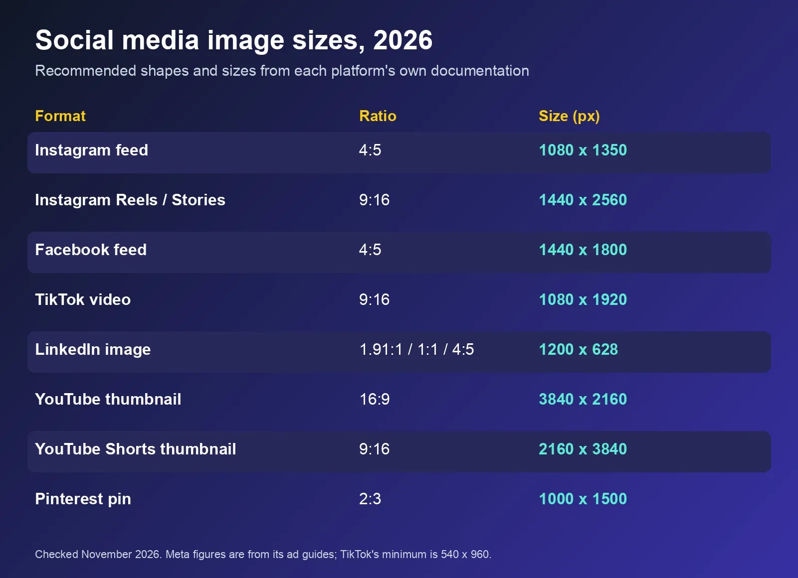
Every platform crops images that don't match its preferred shape, and the crop rarely falls where you want it. Using the right aspect ratio from the start keeps your composition intact. Here are the current recommendations, taken from each platform's own documentation as of November 2026.
| Platform and format | Aspect ratio | Recommended size | Source |
|---|---|---|---|
| Instagram feed post | 4:5 portrait to 1.91:1 landscape; 3:4 and 1:1 also supported | 1080 px wide; 4:5 portrait = 1080 x 1350 | Meta for Developers, Social Media Today |
| Instagram carousel | Same as feed; slides follow the first slide's shape | Up to 20 slides | Meta for Developers |
| Instagram Reels and Stories | 9:16 | Meta's ad guides recommend 1440 x 2560 | Meta Ads Guide |
| Facebook feed image | 4:5 | 1440 x 1800 (ad spec) | Meta Ads Guide |
| TikTok video | 9:16 | At least 540 x 960; 1080 x 1920 is the common upload size | TikTok Ads Help |
| LinkedIn single image | 1.91:1, 1:1 or 4:5 | 1200 x 628, 1200 x 1200 or 720 x 900; max 5 MB | LinkedIn Help |
| LinkedIn document (carousel) | Any page size | Up to 300 pages, 100 MB | LinkedIn Help |
| YouTube thumbnail | 16:9 | 3840 x 2160 recommended; at least 640 px wide | YouTube Help |
| YouTube Shorts thumbnail | 9:16 | 2160 x 3840 recommended | YouTube Help |
| Pinterest pin | 2:3 | 1000 x 1500 | Pinterest Business Help |
| X image | Any; up to 5 MB | Wide (16:9) or square crops display most reliably | X Developer Platform |
Three practical notes on sizes:
- Taller wins in the feed. A 4:5 Instagram post takes up more of a phone screen than a square or landscape one, which gives your image more room to make an impression.
- Carousels follow the first slide. By default, Instagram crops every slide to match the first image, so design all slides at the same ratio.
- Export a little larger than you need. Platforms compress uploads. Starting from a sharp, full-resolution export gives the compression less to damage. Avoid adding heavy grain or fine noise that turns into blotches after compression.
Tip 6: Keep Text Inside the Safe Zone
On Reels, Stories, TikTok and Shorts, the app places your username, caption, buttons and progress bar on top of your video. Anything you put underneath them is hidden.
Meta's ad guidelines say to keep "at least 14% of the top, 35% of the bottom, and 6% on each side" of a 9:16 Reel free of text and logos (Meta Ads Guide). That guidance is written for ads, but it's a sensible default for organic posts too. On a 1080 x 1920 frame, that means:
- the top 270 pixels,
- the bottom 670 pixels,
- and about 65 pixels on each side.
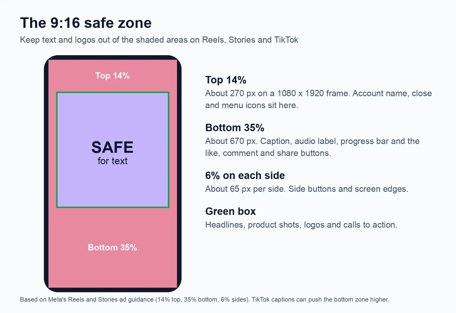
TikTok doesn't publish percentages. Instead, it warns that "the longer the caption, the smaller the safe zone will be" (TikTok Ads Help), because longer captions push further up the screen. If you're turning long recordings into vertical clips, our guide to repurposing long videos for TikTok covers the rest of the workflow. If you post the same vertical video to several apps, keep headlines and key details in the middle of the frame, roughly between the upper third and the lower third.
Tip 7: Design for Everyone
Accessible design is good design. It makes posts easier for everyone to understand, including the many people who scroll with the sound off or in bright sunlight.
- Write alt text. Alt text is a short description of an image that screen readers read aloud. Instagram lets you add custom alt text when you upload (Instagram), and Facebook lets you add or change it before or after posting (Facebook Help). Describe what matters in the image in one or two sentences, and don't start with "image of."
- Caption your videos. WCAG treats captions for prerecorded video as a basic requirement (W3C). Captions also help viewers who watch without sound.
- Don't rely on color alone. If a graphic uses red and green to mean "bad" and "good," add a label or an icon, because some viewers can't tell those colors apart.
- Keep contrast high. Use the 4.5:1 contrast rule from Tip 4 for any text placed on an image.
Tip 8: Be Transparent About AI Edits
AI tools make edits like sky replacement, object removal and background blur fast and easy. Platforms have also started labeling AI content, so it helps to know how labels work.
Meta renamed its "Made with AI" label to "AI info" in 2024, after retouched photos were labeled by mistake. It then moved the label into the post menu for images that were only edited or modified with AI, while fully AI-generated content keeps a visible label (Meta Newsroom). Meta detects AI using "industry-shared signals" in image files, or labels it when creators disclose it themselves.
TikTok automatically labels AI-generated content made on other platforms when the file carries C2PA Content Credentials (TikTok Newsroom). It also requires creators to label realistic AI content, and it said in November 2025 that it had labeled more than 1.3 billion videos (TikTok Newsroom).
What this means for you:
- Basic edits like exposure, color and cropping are normal photo editing.
- Heavier AI edits may carry file information that platforms read, so a label could appear.
- If an edit changes what really happened, such as a fake event or a person who wasn't there, disclose it. Honesty protects the trust your design is meant to build.
Creative Tools That Speed Up Social Media Design
You don't need a full design studio to create strong social media visuals. Most of the work happens in two places: a photo editor and a layout or template tool.
A mobile photo editor handles the foundation from Tip 1 and the creative techniques from Tip 3. Look for one that offers:
- One-tap enhancement to fix light and detail quickly.
- AI masking that selects the sky, a person or an object automatically, so you can edit just that area.
- Sky replacement and atmospheric effects for landscapes and travel shots.
- Portrait tools such as natural skin smoothing and background blur.
- Film looks or presets you can reuse to keep a consistent style.
- RAW support if you shoot RAW on your phone or camera.
- Sync between phone and desktop so you can start an edit on one device and finish on another.
Skylum's Luminar, for example, offers these features on mobile and in a web browser, including Enhance AI, Sky AI, Skin AI, Film Looks, Auto Masking, Portrait Bokeh and RAW support, with apps for iOS and Android.
A layout or template tool adds text, shapes and brand elements and exports to the right size for each platform. Save templates for your most common formats, such as a 4:5 feed post, a 9:16 Story with safe-zone guides, and a carousel cover, so each new post starts from your visual system instead of a blank canvas.
A content calendar keeps your feed varied. Plan posts a week or two ahead and check how they will sit next to each other on your profile grid before you publish.
A Quick Pre-Publish Checklist
Run through this list before every post:
- Is the subject clear and in focus?
- Is the image cropped to the right aspect ratio for this platform?
- Does it still read well at phone size?
- Is any text short, high in contrast and inside the safe zone?
- Does it match your colors, fonts and editing style?
- Did you add alt text and, for video, captions?
- If you used heavy AI edits, would your audience expect to be told?
Frequently Asked Questions
What is the best size for an Instagram post in 2026?
Instagram supports feed images from 4:5 portrait to 1.91:1 landscape, and it added support for 3:4 photos in 2025. A 4:5 portrait image at 1080 x 1350 pixels takes up the most screen space in the feed and is the safest default for most posts.
What is a safe zone in social media design?
A safe zone is the area of a vertical video or image that stays visible after the app adds its own buttons, captions and usernames. Meta's guidance for Reels ads is to keep the top 14%, bottom 35% and 6% on each side free of text and logos.
How many colors and fonts should I use on social media?
Most consistent accounts stick to two or three brand colors and one or two typefaces: a distinctive font for headlines and a simple one for longer text. A small, repeated set makes your posts recognizable in the feed.
Do edited photos get an AI label on Instagram?
Usually not for basic edits like brightness, contrast and color. Meta shows "AI info" for content it detects or that creators disclose as AI-made or AI-modified. For images that were only edited with AI, the label sits in the post menu rather than on the image.
Do I need professional software for social media design?
No. A good mobile photo editor and a simple layout tool cover most needs. What matters more is a clear subject, the right size for each platform and a consistent style.
Conclusion
Your social media presence is an opportunity to show your perspective and creativity. Start with a strong photo, compose it for a small screen, size it for each platform and keep your message clear. Then test unexpected combinations, explore new visual styles and learn from the content that resonates with your audience. Every post gives you a chance to discover what works best for your ideas.