SaaS Onboarding Email Templates That Reduce Churn
Spybroski Team
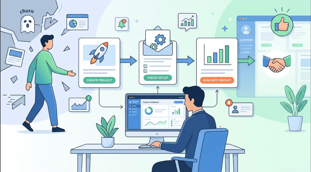
A user signs up for your SaaS product, opens the dashboard, clicks around for five minutes, and disappears. Nothing technically went wrong. The account worked. The features were there. The problem was simpler: the user never reached the point where the product felt useful.
That first stretch after signup matters more than many SaaS teams expect.
Poor onboarding usually creates friction rather than an obvious failure. A new customer may not know which feature to try, what to configure first, or what result they should expect. They postpone setup, stop logging in, and eventually cancel because the product never became part of their workflow.
Onboarding emails can close that gap. A useful message might guide someone back to an unfinished setup step, explain one feature they actually need, or lead them toward their first useful result.
This is also where email template design matters. Clear hierarchy, short instructions, good timing, and one obvious next action reduce the amount of thinking required from a new user. The goal isn’t to send more emails. It’s to create onboarding emails that help people use the product, understand its value, and find a reason to come back before churn becomes the easier choice.
The SaaS Onboarding Emails Every New User Should Receive
A good onboarding sequence should answer one question at a time: “What should I do next?” Users often judge a product before they’ve seen its full value. Wyzowl’s survey of 216 people found that 63% consider post-sale onboarding and support when deciding whether to buy.
-
The welcome email
Confirm the account, explains what happens next, and points to one useful first action, such as creating a project or inviting a teammate. -
The setup email
Help users finish key steps, including integrations, profile settings, or data import. -
The first-value email
Lead users to the action that creates their first clear result. For a reporting tool, that might be generating the first report. -
The feature education email
Introduce features only when they match the user’s current stage and needs. -
The inactivity email
Bring back users who started setup but stopped, ideally with a direct link to where they left off. -
The support email
Give users a simple way to contact support before confusion turns into cancellation.
What Makes an Onboarding Email Template Work
A good onboarding email doesn’t try to explain everything at once. It gives the user one clear next step and makes that step easy to complete. The message should match what the person has actually done in the product, not arrive simply because three or five days have passed. That distinction matters. Someone who has created an account but hasn’t finished setup needs different guidance from a user who has already tried the main feature.
Subject lines should be equally specific. “Finish setting up your workspace” tells the reader much more than “Welcome back.” The same logic applies to the CTA: one main button is usually enough.
Email template design plays a practical role here too. Clear spacing, short headlines, readable buttons, and mobile-friendly formatting help users move through the message without stopping to figure out what matters. Screenshots are useful when they explain a difficult step. Otherwise, they often create noise.
How to Build Email Templates That Reduce Churn
Most often churn begins before the customer leaves. It begins when the product becomes more difficult than anticipated, or the following action is not clear. That's where onboarding emails can come in handy.
-
Identify the event that starts the story. Set the time when the user utilizes the product for the first time and gets real value from it.
-
Adhere to the behavioral guidelines rather than a calendar. Email following completed, missed, or stalled actions.
-
Limit the number of goals to one for each email. Too many links will induce hesitation, while a clear CTA will make it clear what is next.
-
Tackle only what is important to customize. If the advice changes due to a change in the role, plan, goal, or activity, then use role, plan, goals, or activity.
-
Enhance the design of email templates. Setting up clear hierarchy, spacing, readable buttons, and consistency with visuals makes for less friction.
-
Measure the following. Opens the door to the matter, but activation, product usage, drop-off points, and churn highlight whether it works or not.
Mistakes That Make SaaS Onboarding Emails Less Effective
Onboarding emails become less effective when they create more work than clarity. Sending another message before a user has finished the previous step can feel pushy, while listing every product feature often hides the one action that matters most. CTAs should be specific: “Create your first project” is far more useful than “Learn More.” The same sequence should not go to everyone, either. A customer who is actively using the product needs different guidance from someone who signed up and never returned. Email template design matters here because spacing, headlines, and button placement should direct attention rather than simply make the message look polished. Inactive users also need a useful reminder and an easy way to get help. Finally, open and click rates are not enough. The stronger signal is what happens after the email: whether users complete key actions, reach activation, keep using the product, and stay subscribed longer.
Turn Onboarding Emails Into a Retention Tool
Good onboarding is not about sending more messages. It is about helping users reach value quickly, with fewer questions and fewer reasons to give up. That starts with timing. Send an email when a user completes, skips, or stalls on an important step, then keep the copy focused on what should happen next. Clear email template design matters just as much: readable headlines, simple layouts, and one obvious CTA make the path easier to follow.
SaaS teams should review these emails alongside activation and churn data, not in a separate marketing report. If users open a message but still fail to finish setup, the sequence needs work. The same is true when engagement looks strong but retention drops after the trial.
The best onboarding sequence should not feel like a campaign. It should feel like a helpful person beside the customer, pointing to the next useful action at exactly the right moment.